BRAZELL PHYSICAL THERAPY & WELLNESS
Brazell Physical Therapy & Wellness (BPT&W) is a boutique practice specializing in physical therapy and rehabilitation, pelvic health, and holistic wellness coaching. As a women-owned business in a small town, founder Rachel sought a brand that reflects her expertise and professionalism while staying true to her compassion and passion for wellness.
THE LOGO
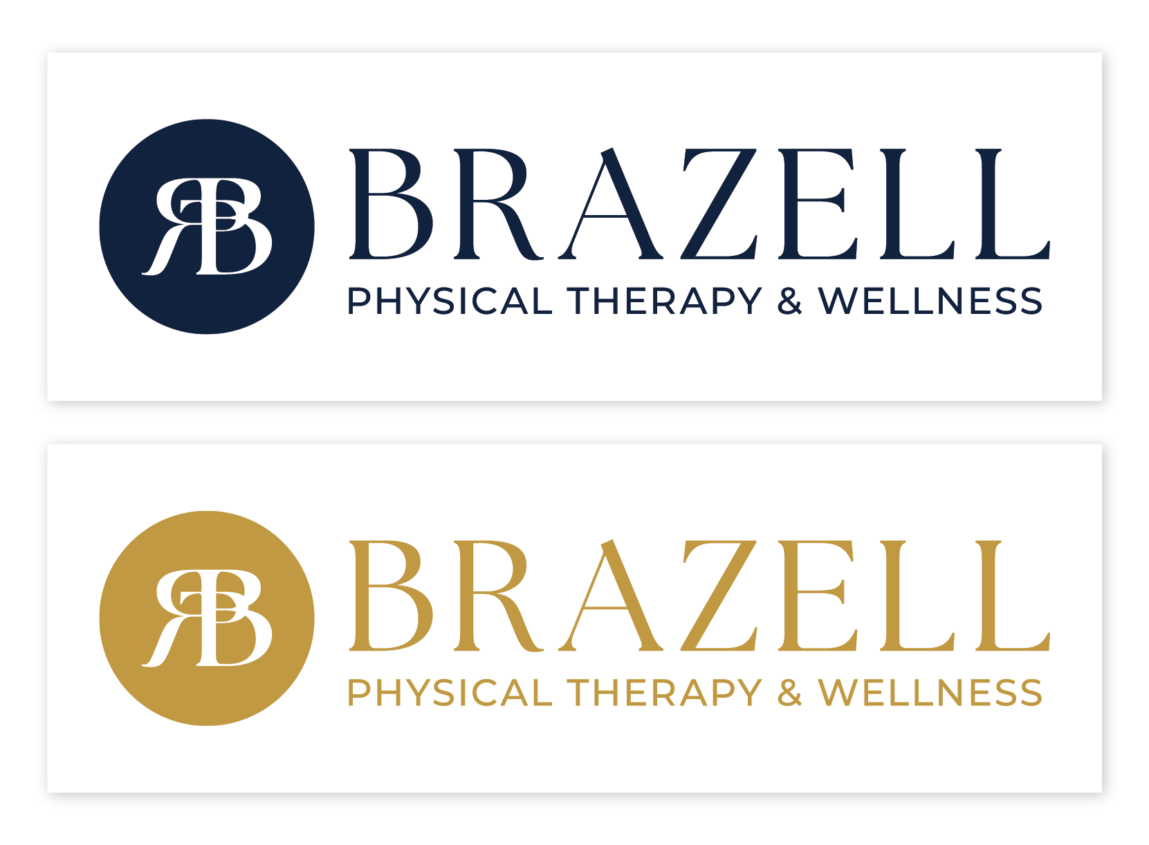
The logo combines Rachel’s personal monogram with the initials for physical therapy, her primary focus. A serif typeface adds sophistication, balanced by the smooth circular lines and a clean sans-serif subheader.
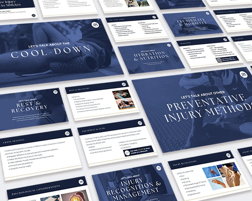
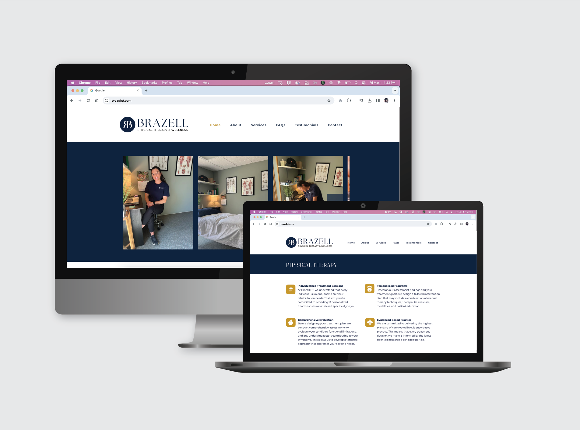
The primary palette of blue and gold reflects the brand’s core values—blue for trust, stability, and calm, and gold for warmth, optimism, and vitality. Secondary colors introduce softness and approachability: pinks convey compassion and human connection, while light blue adds clarity and ease.
Throughout the brand, vector line art and circles reinforce themes of movement, guidance, balance, and centering, echoing the holistic approach of Brazell Physical Therapy & Wellness.


